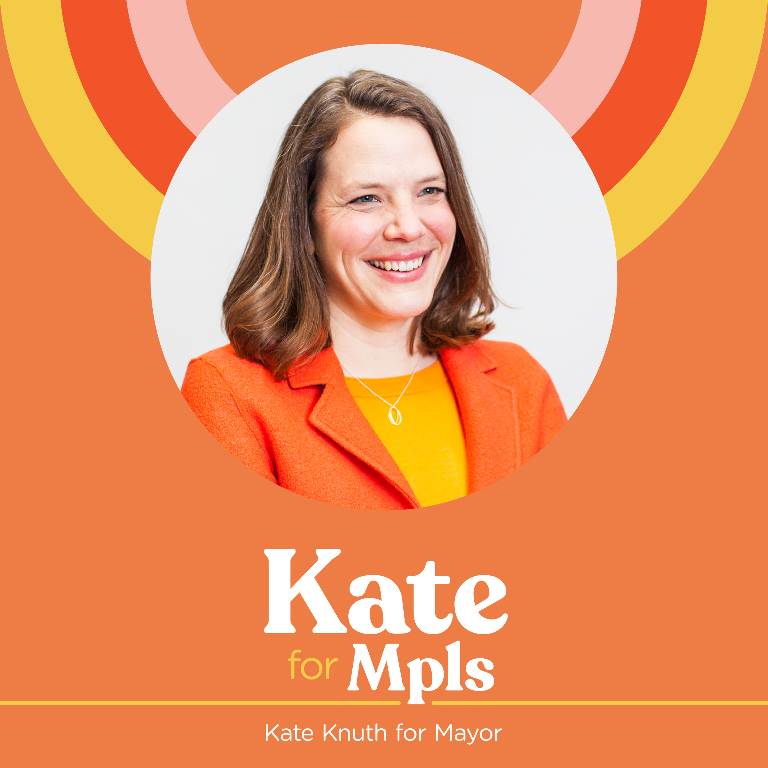
Kate for Mpls.

A good friend of mine, Ashley Fairbanks, reached out last month in need of an assist on a quick-turn-around project. Ashley Is a brilliant veteran of political campaigns and a designer, so I was thrilled when she asked me to design the identity for a new mayoral candidate in Minneapolis, Kate Knuth.
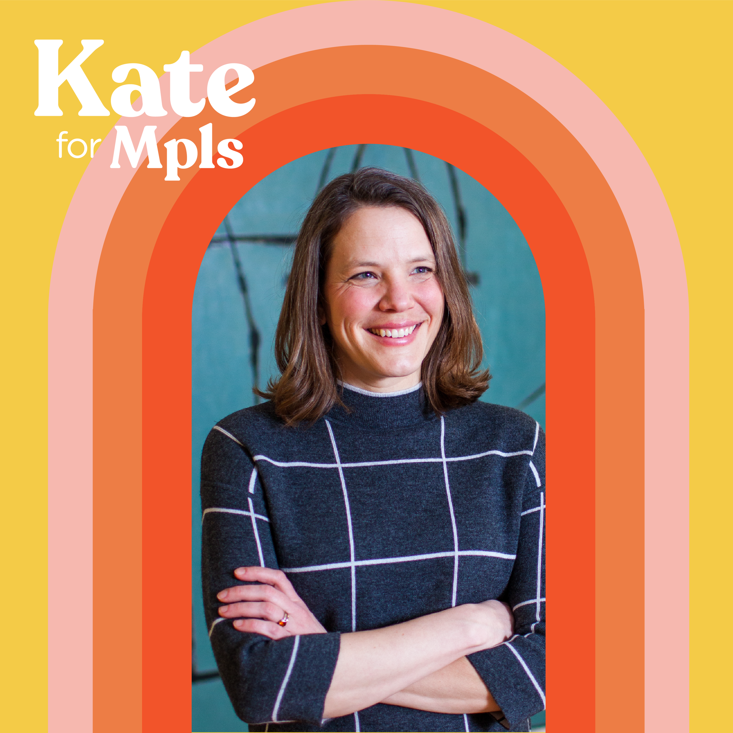
Orange was non-negotiable as it is Kate’s signature color, and Ashley wanted a bold, rounded serif that leaned into and not away from the fact that Kate is a female candidate surrounding herself with a powerhouse staff of women. When compared to the branding of the other candidates in the race, Kate’s needed to be stronger, bolder, and more approachable. It also needed to exude joy and hope—Minneapolitans are looking for some light after this past year.
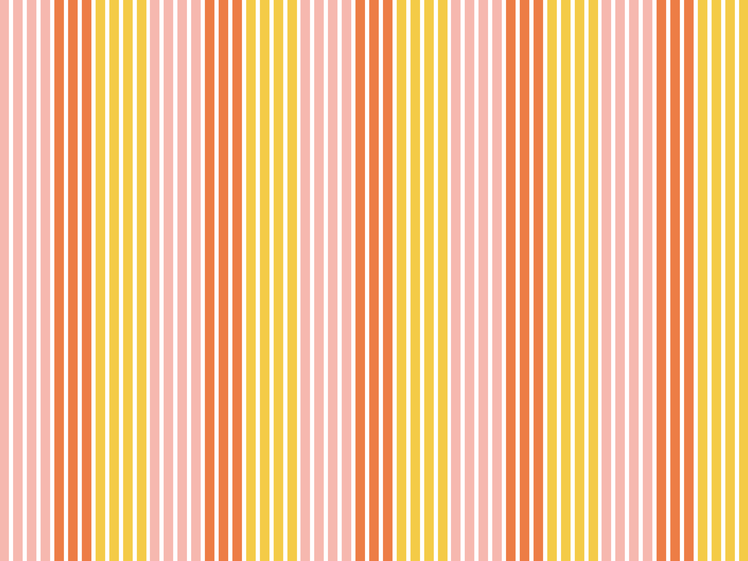
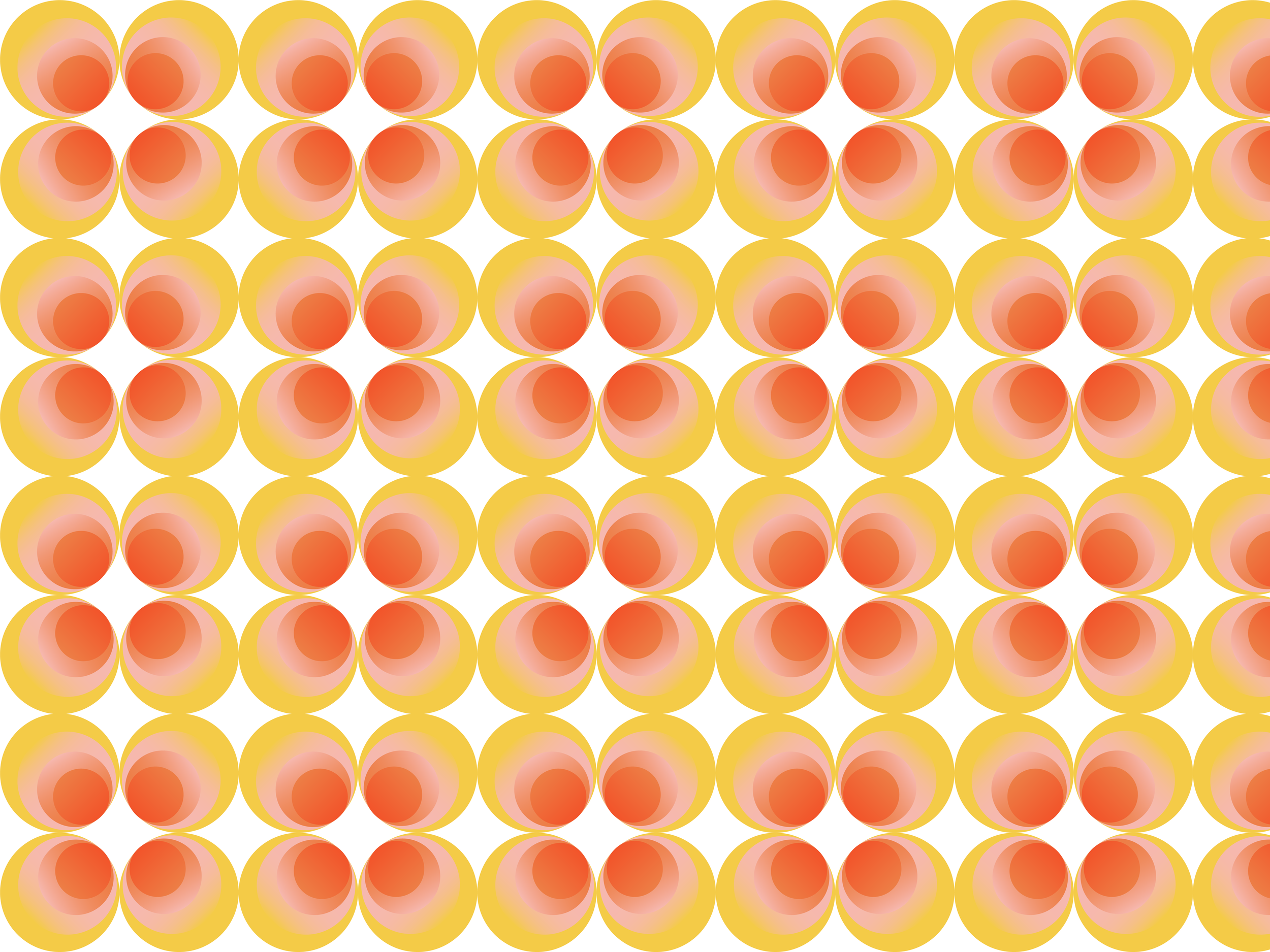
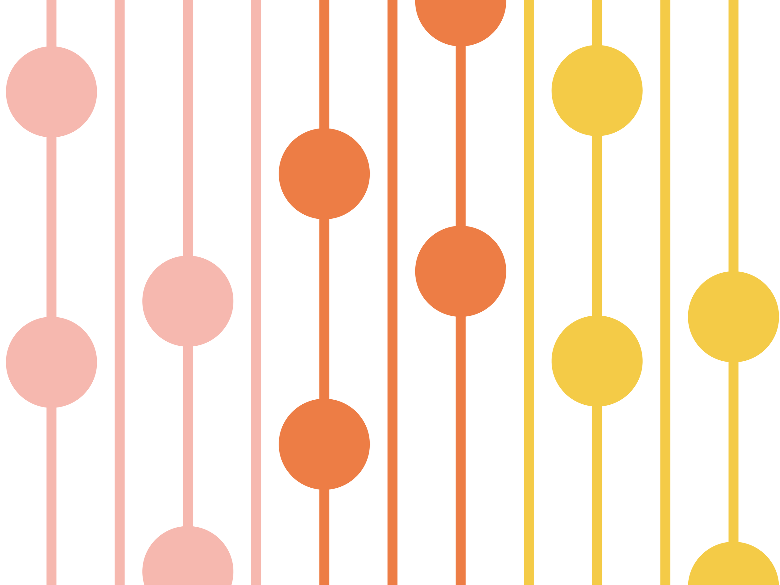
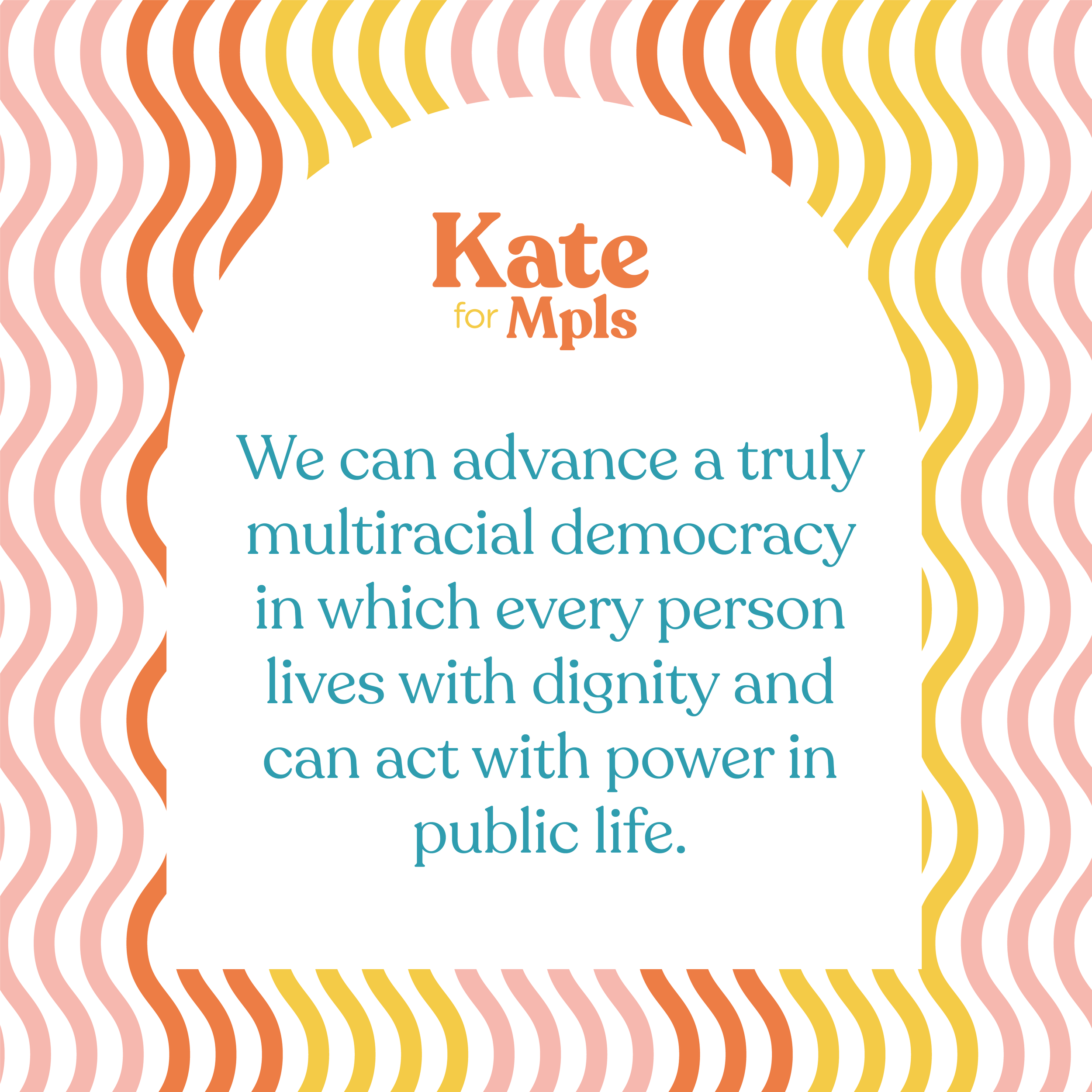
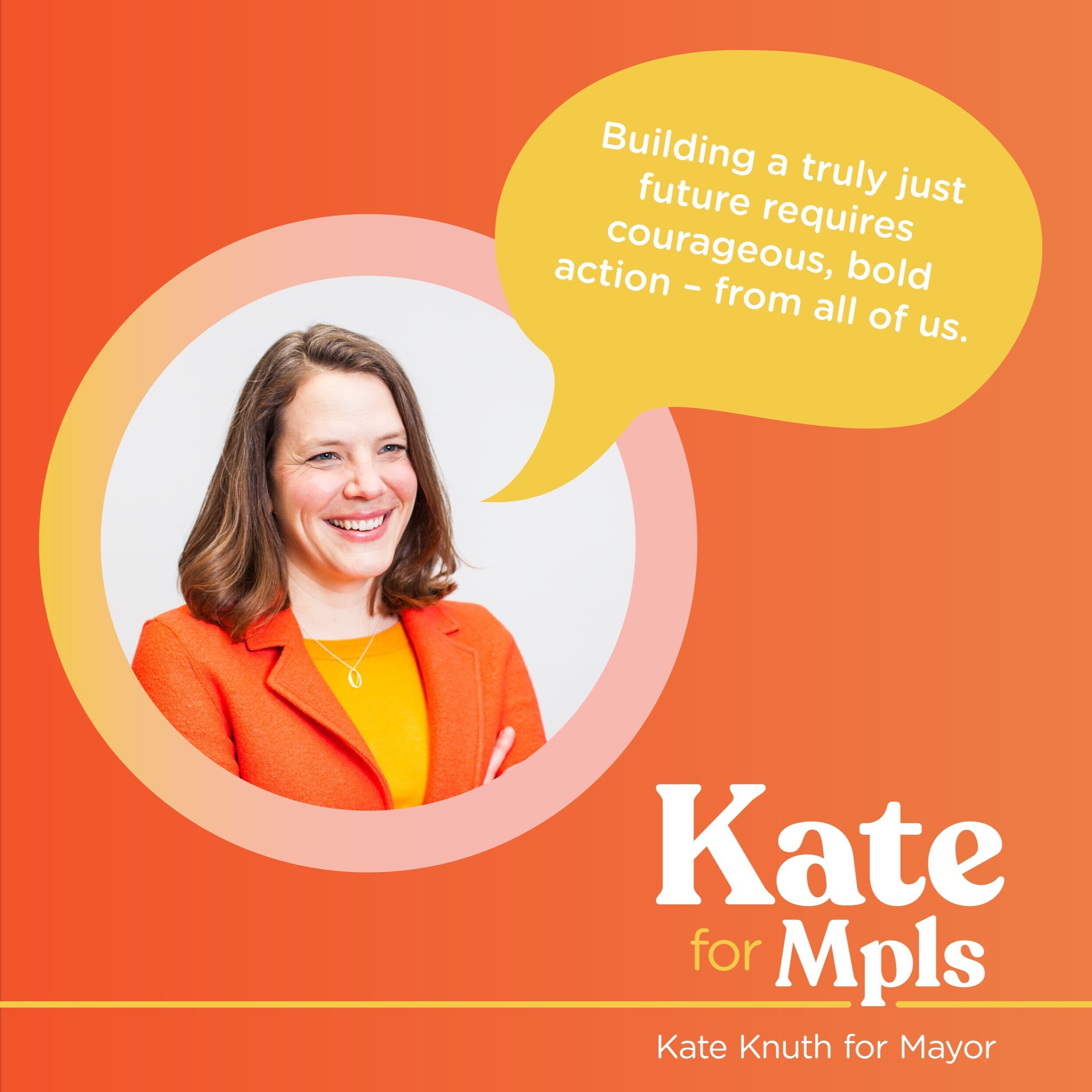
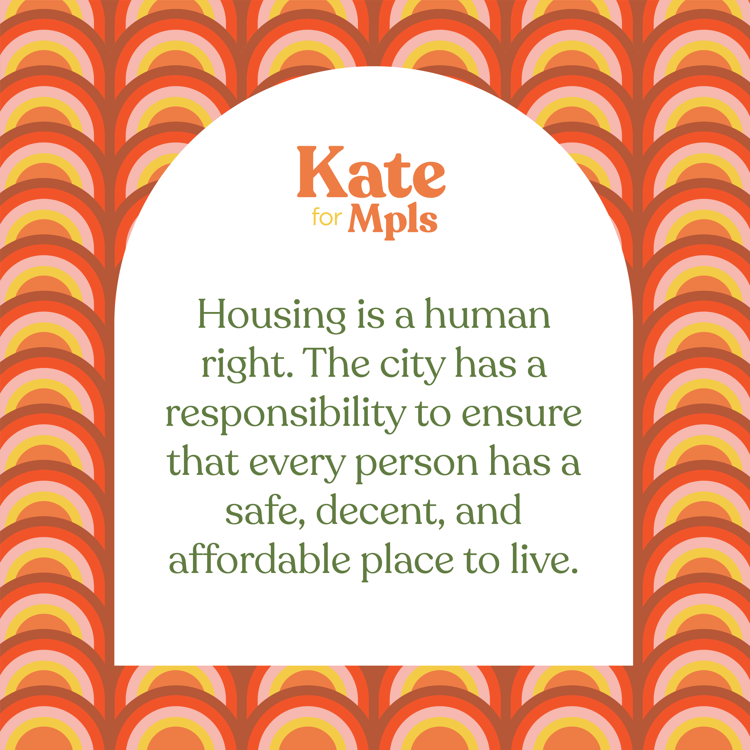
With that in mind, I designed a toolkit for Kate’s campaign that is bold and colorful, with a taste of 70s funk and feminine energy. Beyond a logo, I designed a library of patterns for use across Kate’s platforms, as well as a dozen social media templates for her team to use throughout the campaign. It has been fun watching the campaign roll out over the past few weeks and I can’t want to see this logo pop up on lawn signs around the city this spring!
Client: Kate for Mpls campaign
Team: Ashley Fairbanks: Creative Direction; Maren Nelson: Design
Scope: logo, identity system, pattern library, social media templates
Type: Recoleta by Jorge Cisterna for Latinotype, Gotham Rounded by Hoefler&Co.


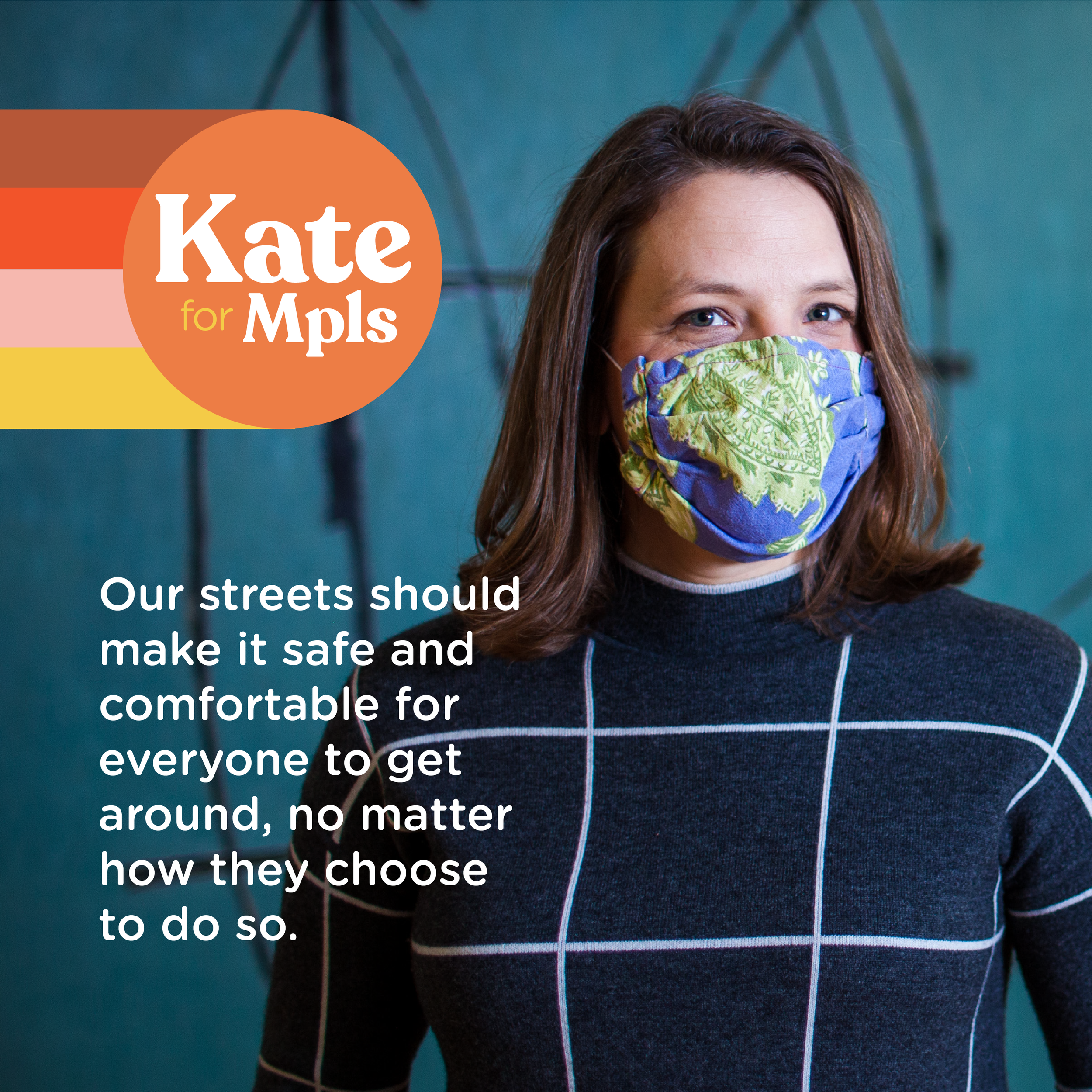
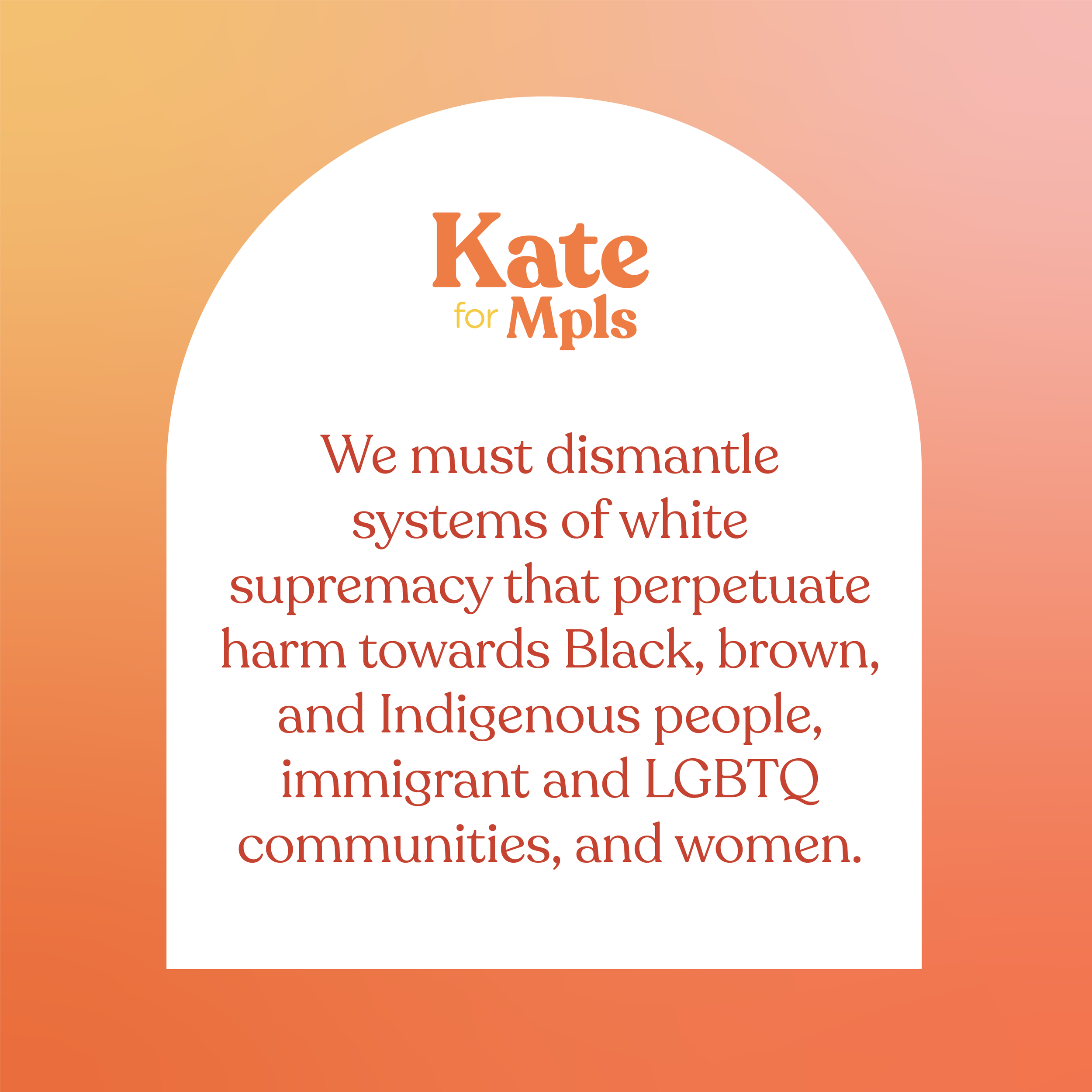
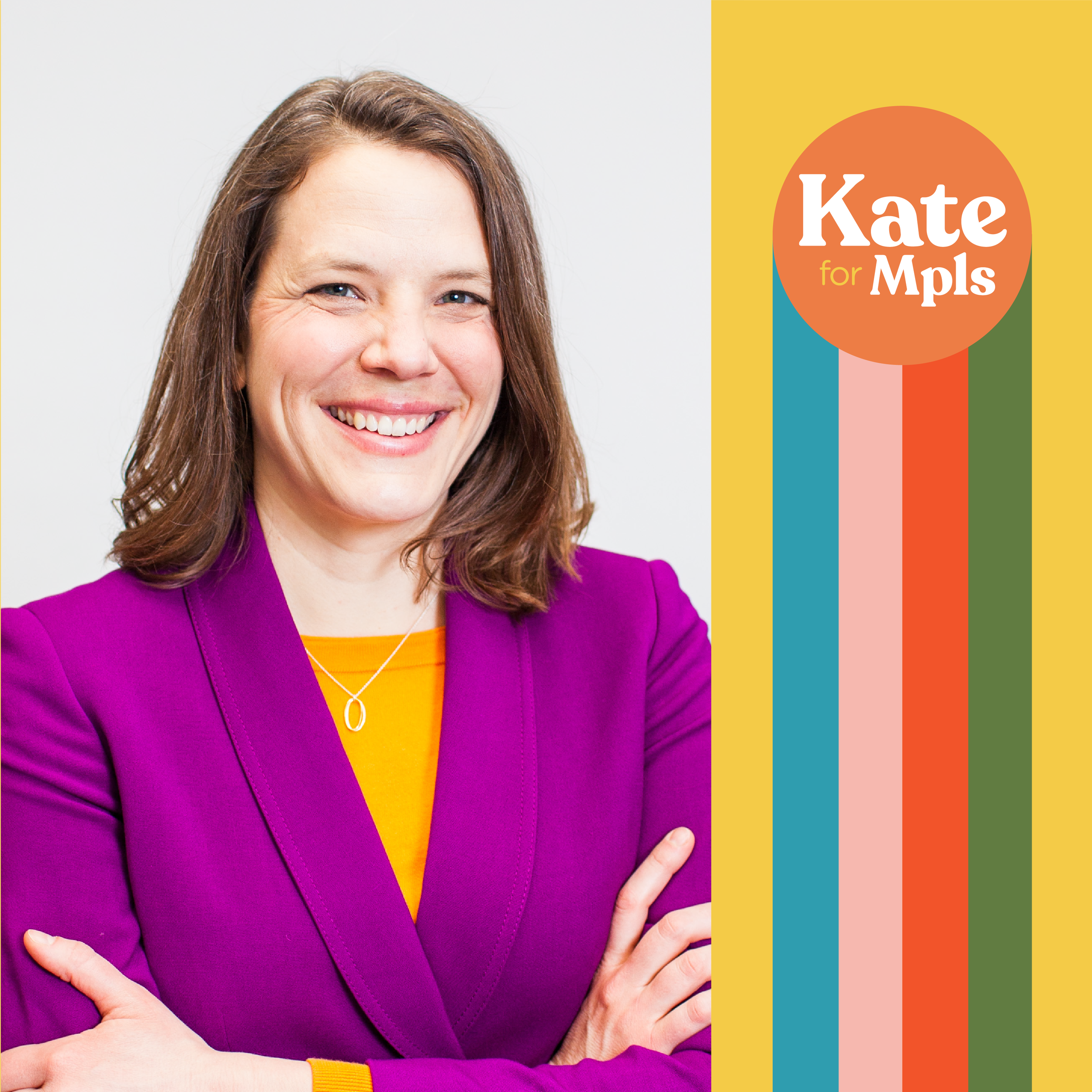
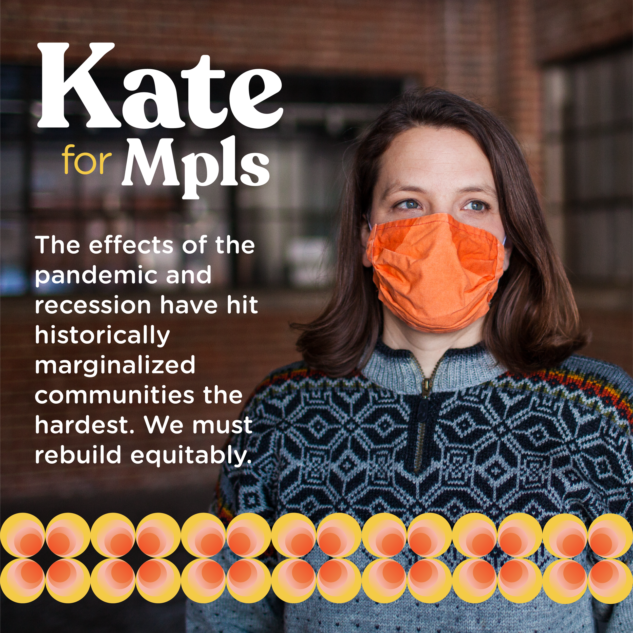
Social Media Templates
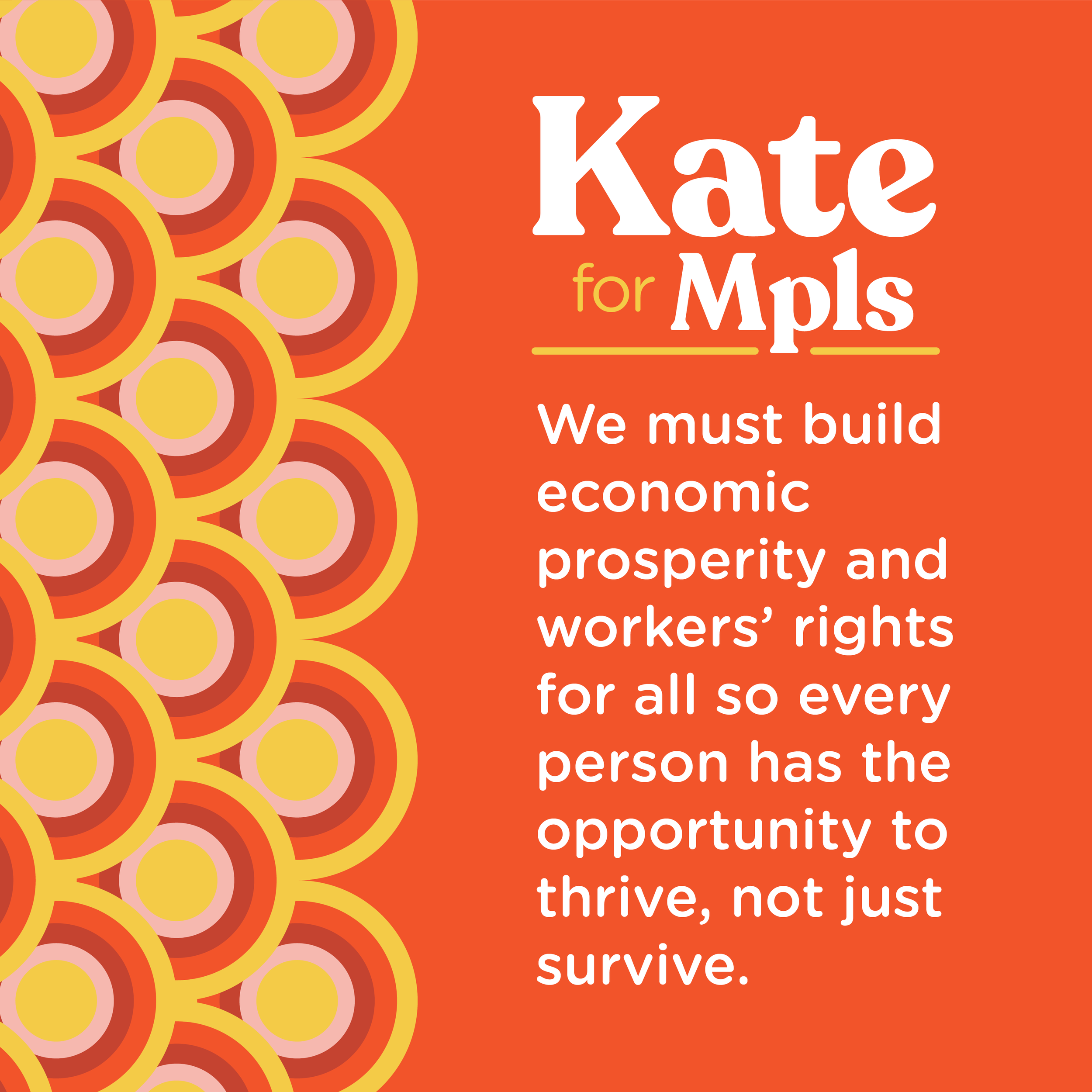
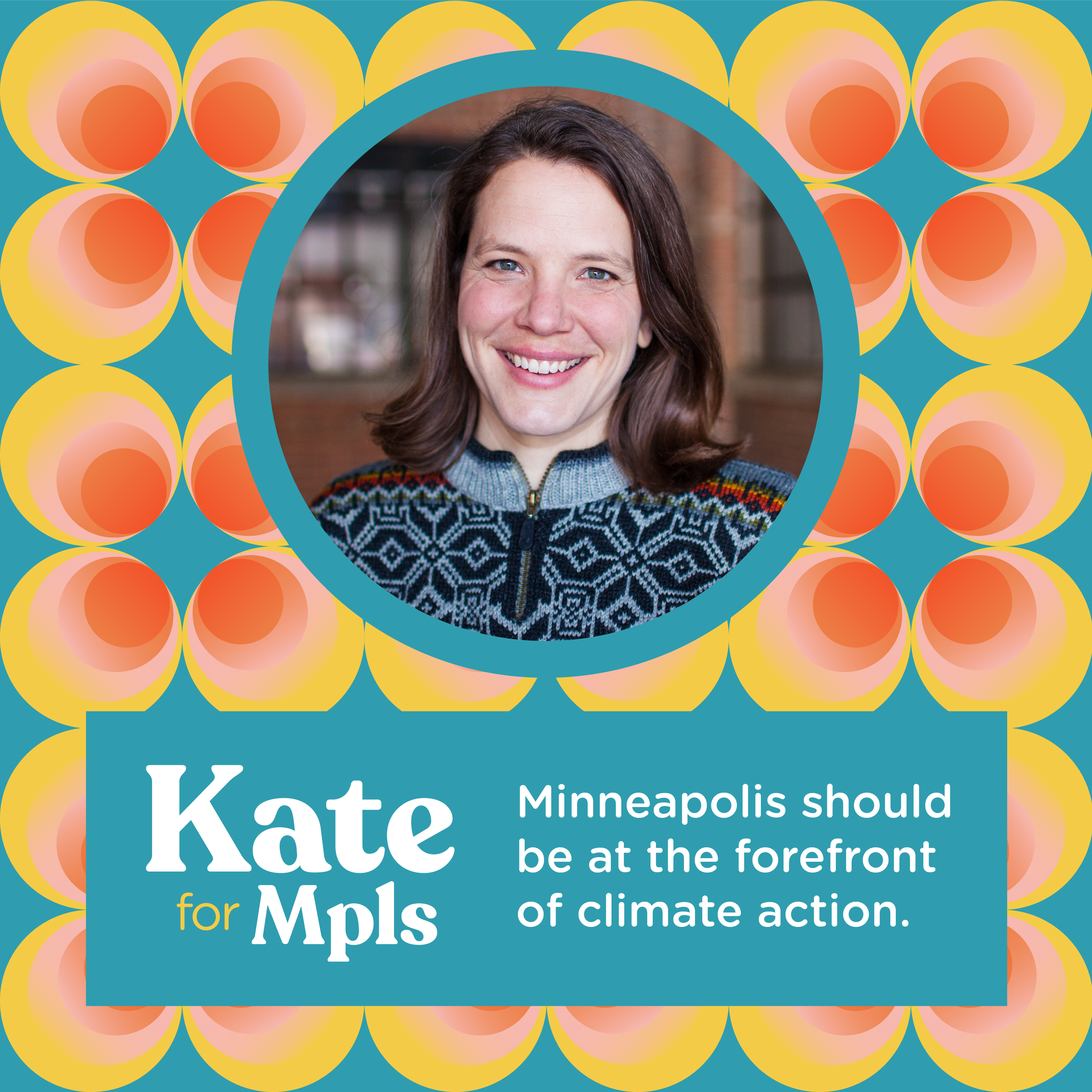
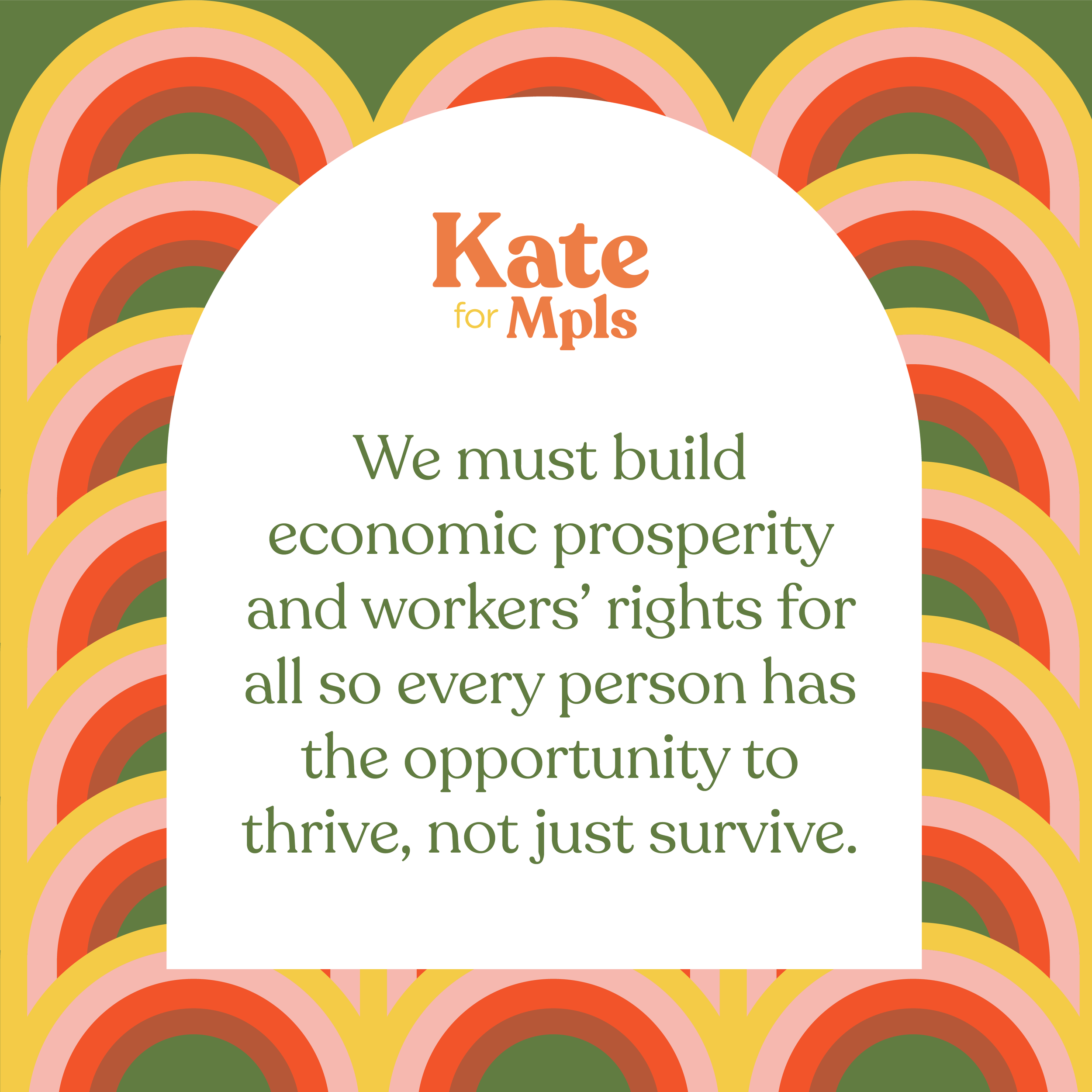
Patterns