
Kate for Mpls:
Political Campaign
Client: Kate for Mpls campaign
Team: Ashley Fairbanks: Creative Direction; Maren Nelson: Design
Scope: logo, identity system, pattern library, social media templates
Type: Recoleta by Jorge Cisterna for Latinotype, Gotham Rounded by Hoefler&Co.
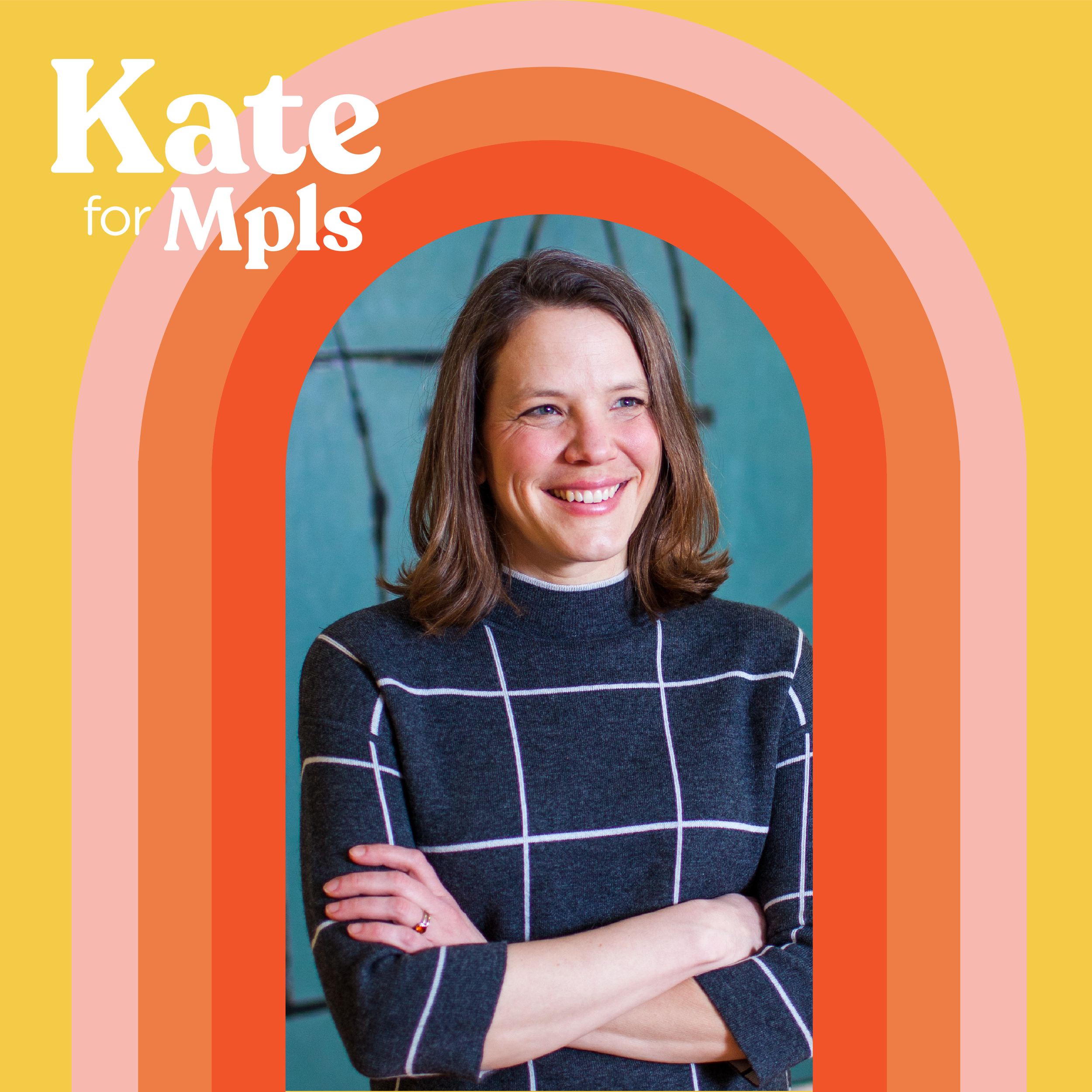
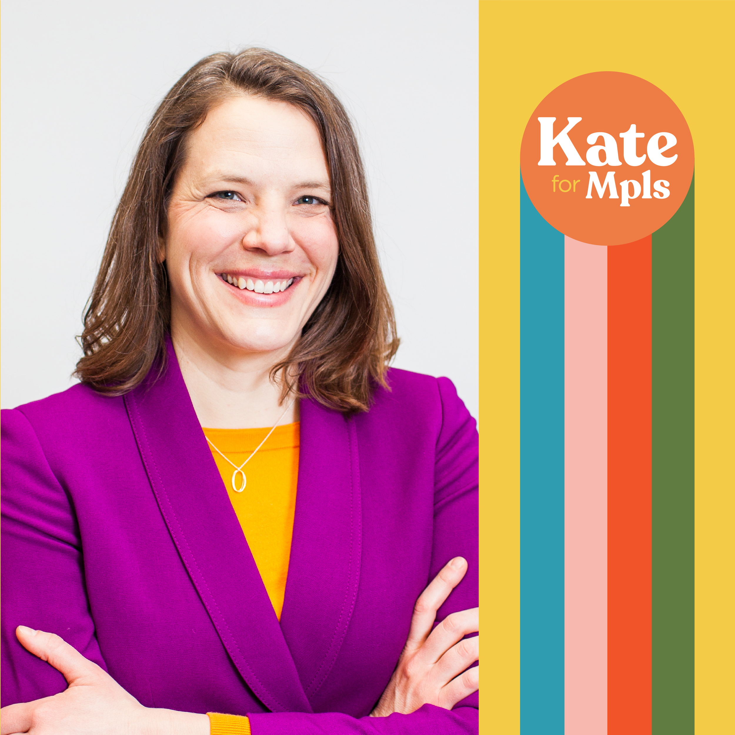
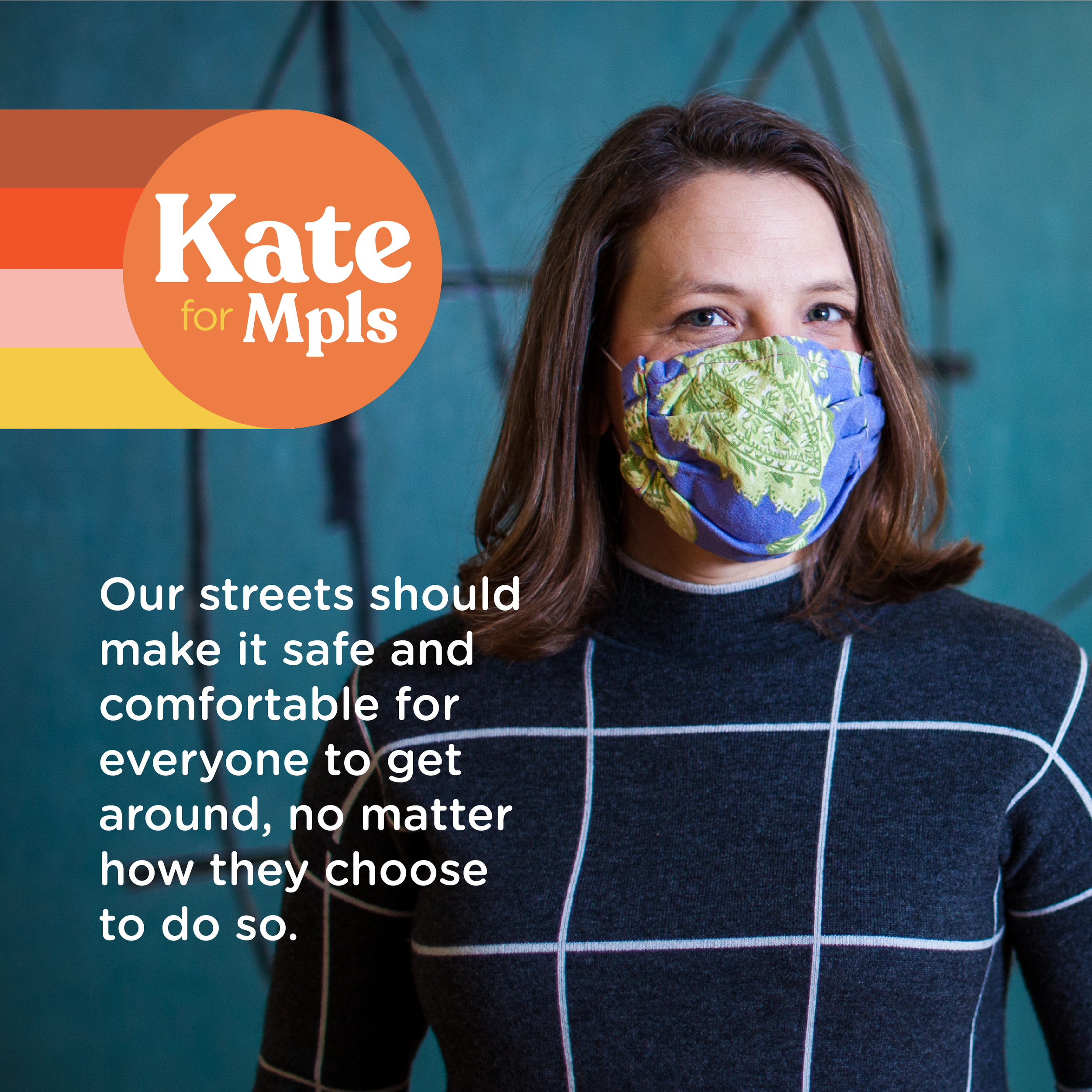
The Kate for Mpls campaign logo and identity was designed for the 2021 mayoral campaign for Kate Knuth. A challenge to the status quo after one of hardest years in Minneapolis’ history, the campaign needed to exude hope and clarity. Taking cues from the candidate’s personality and the vibrant city she hopes to represent, the Kate for Mpls campaign identity exploded onto the electoral scene and graphically dominated the competition.


Concept & Use
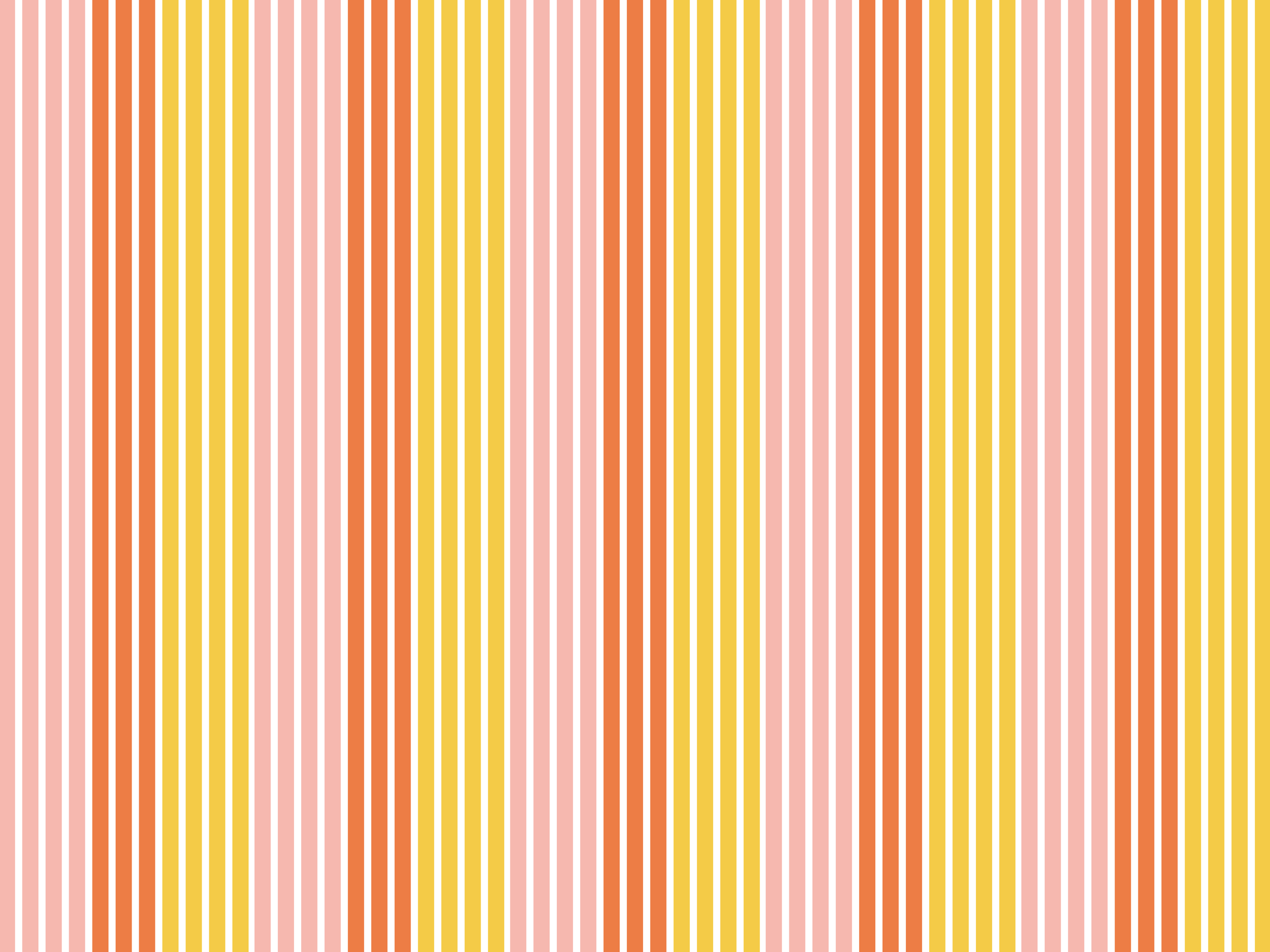
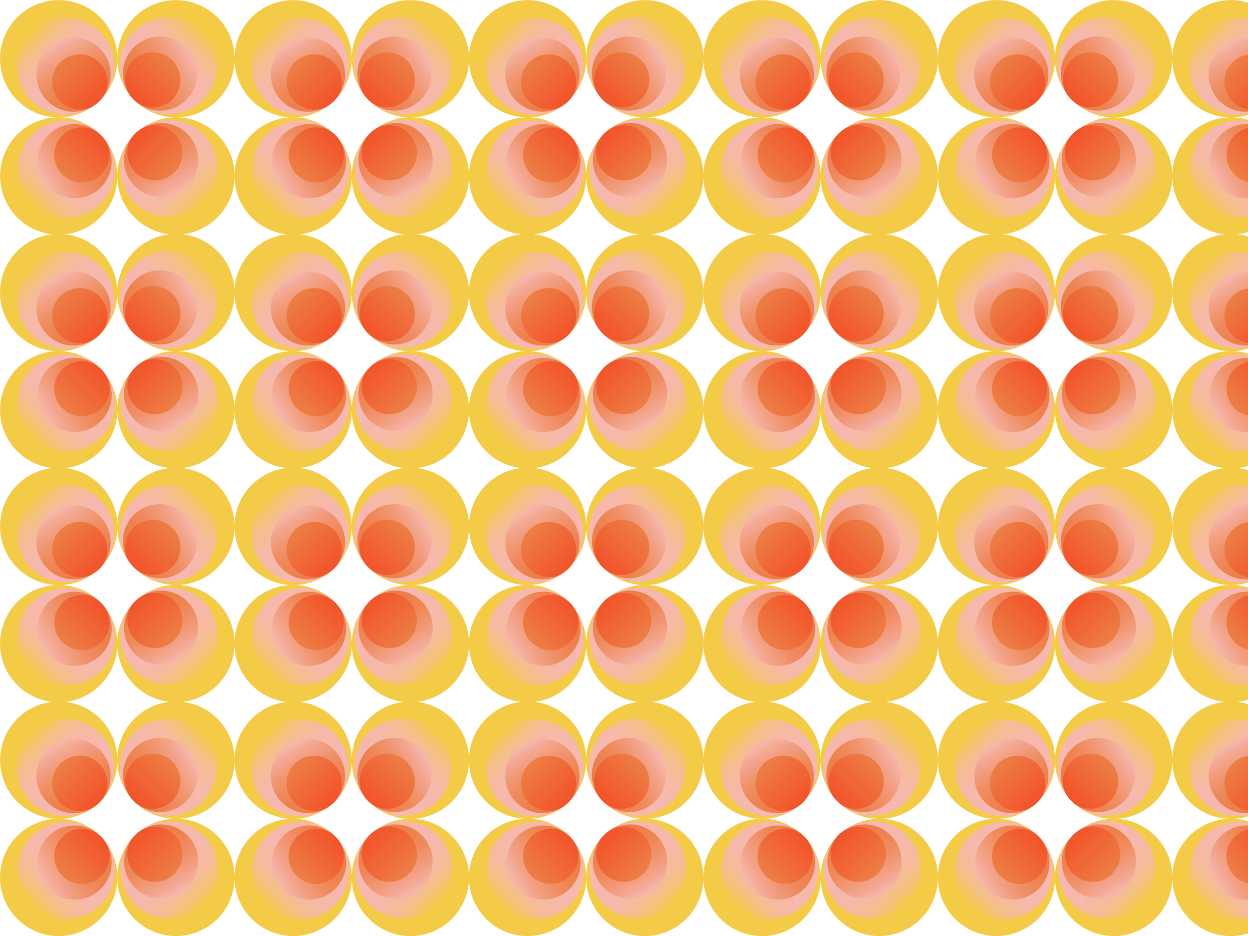
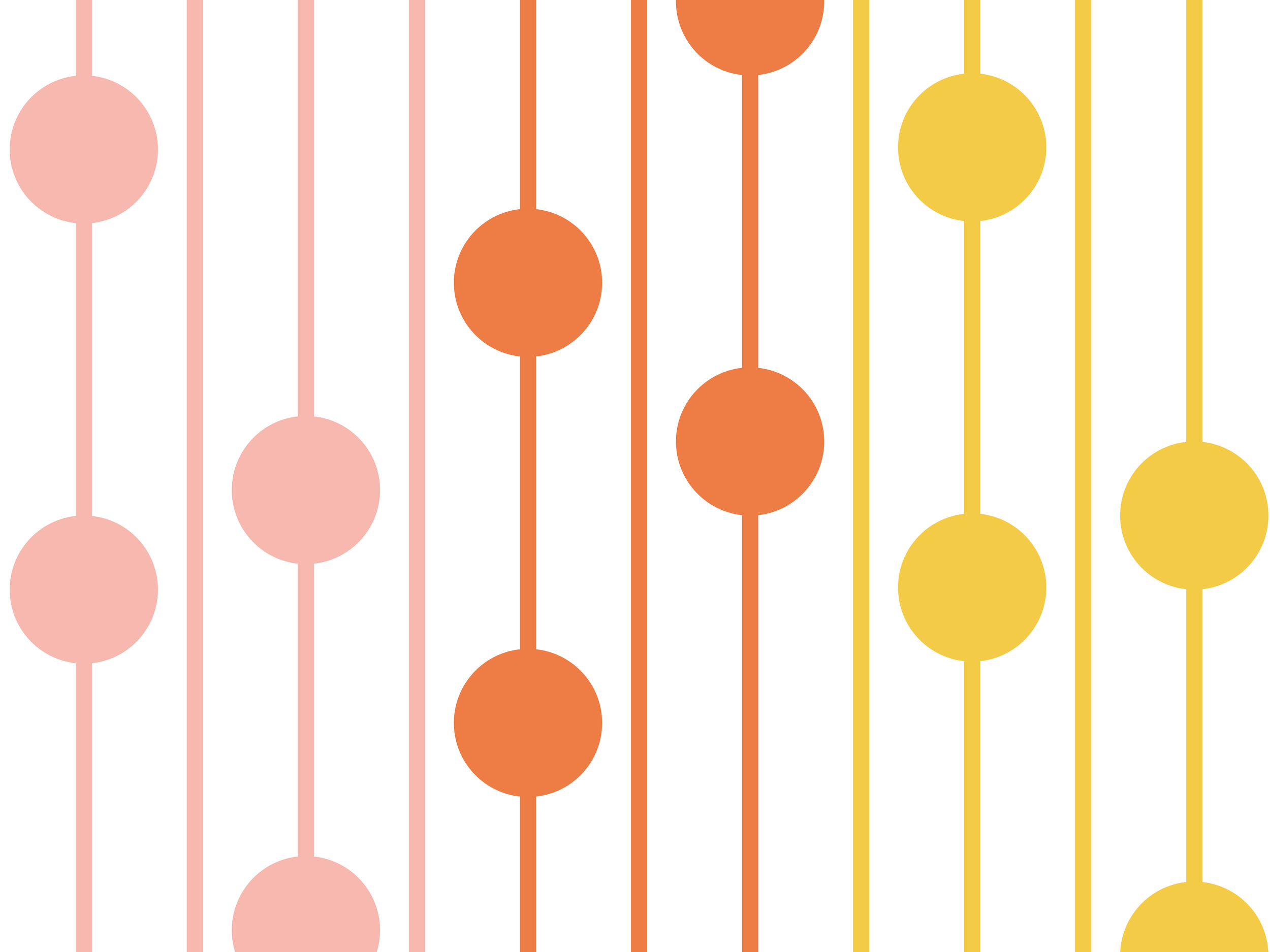
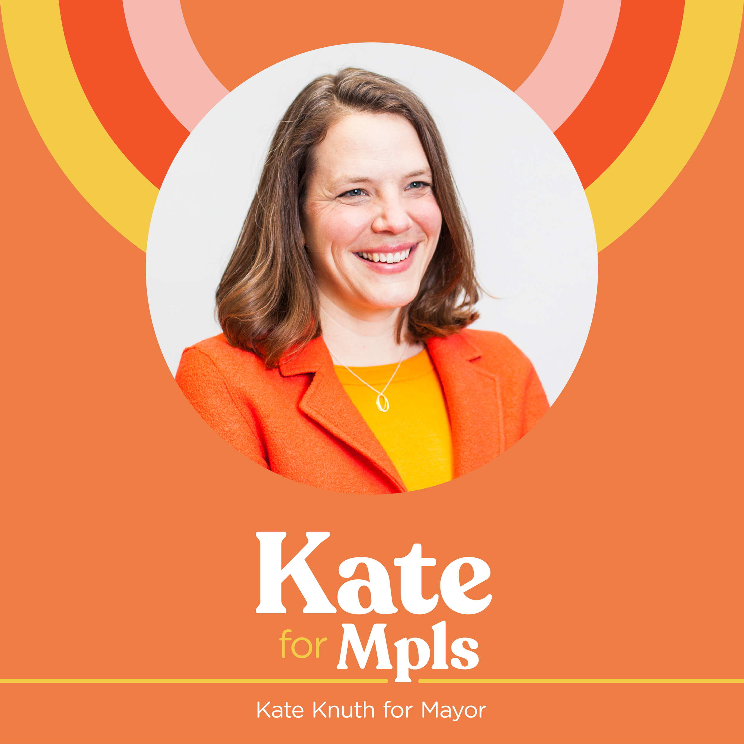
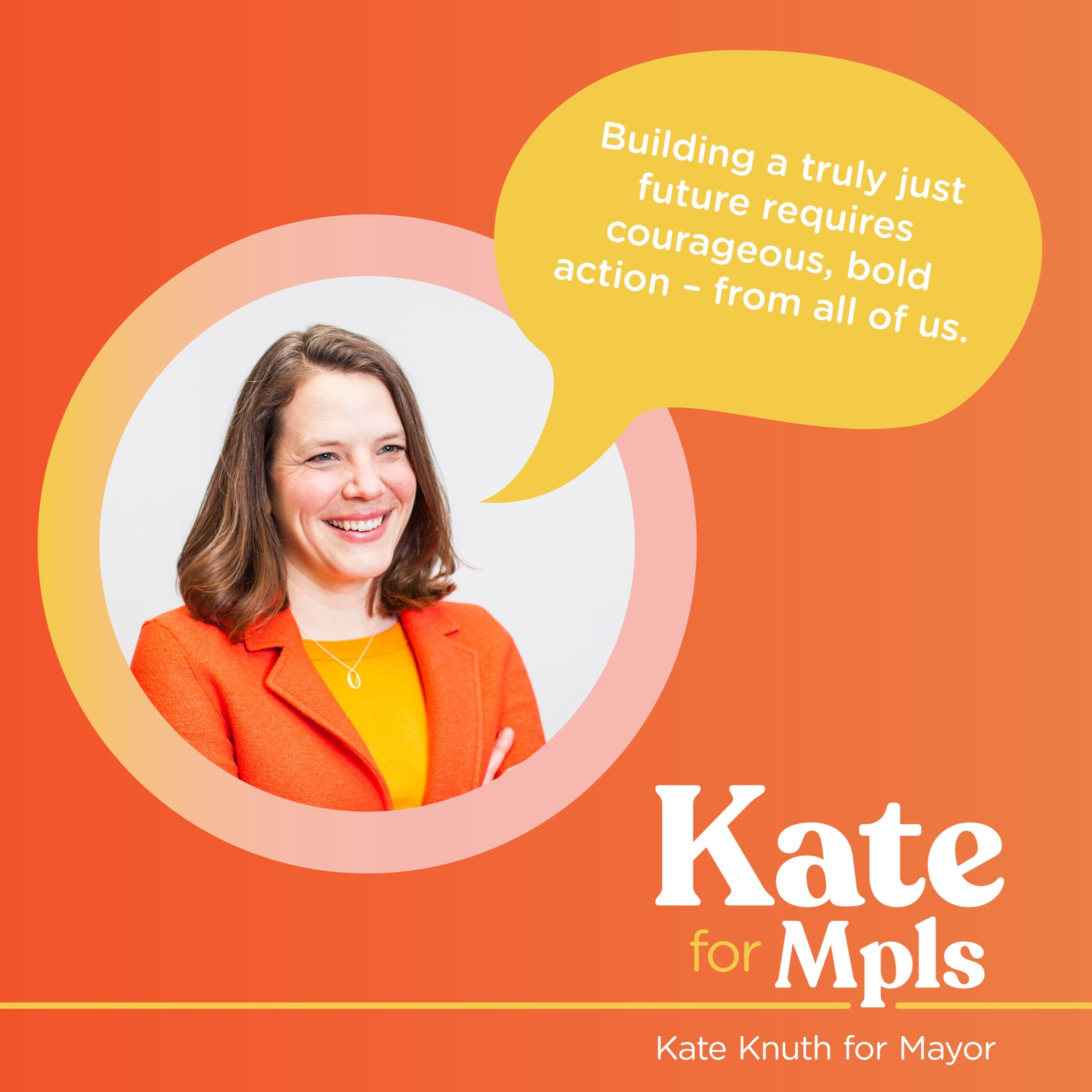
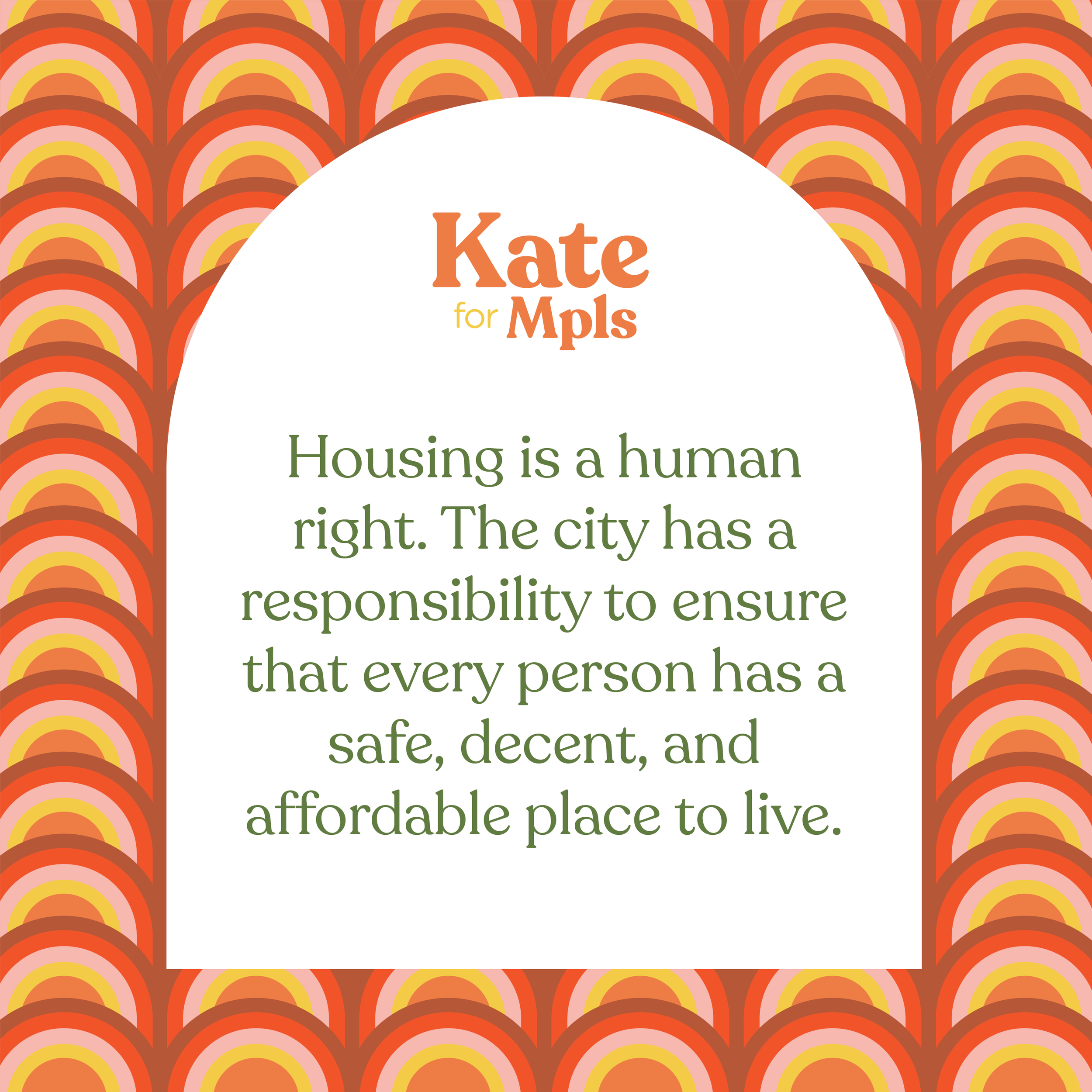
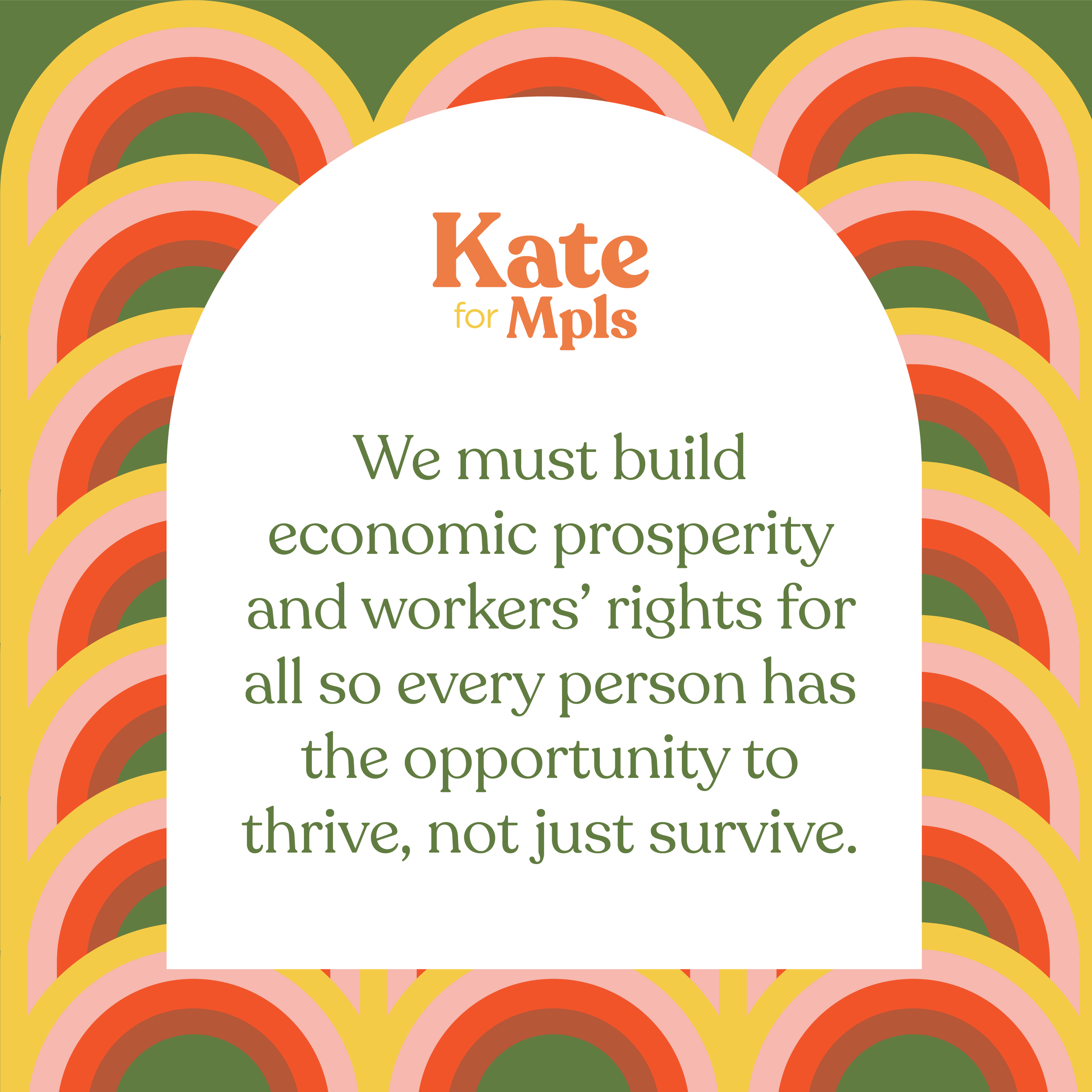
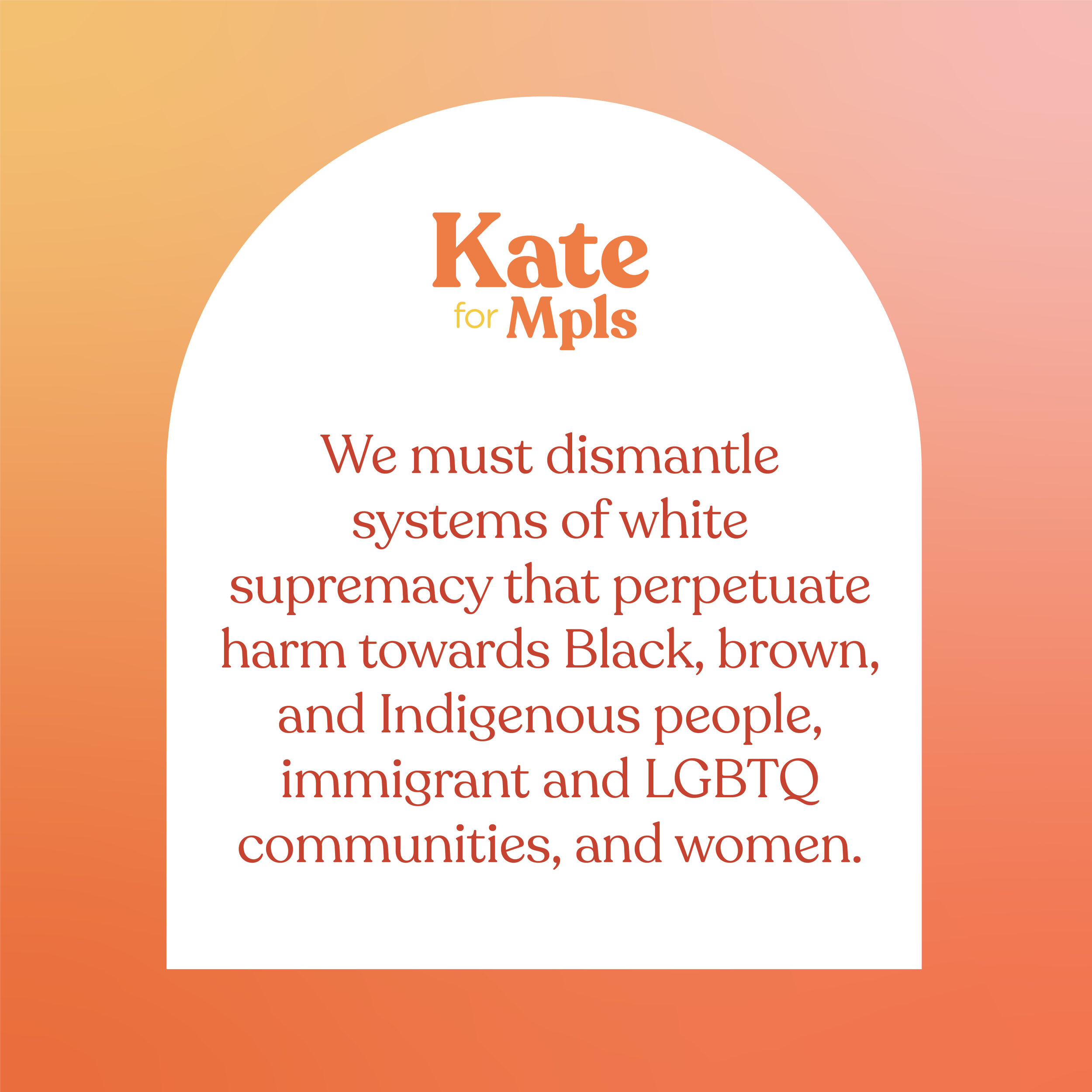
The Kate for Mpls campaign is not your average campaign identity. Orange was non-negotiable as it is Kate’s signature color, and the campaign wanted a bold, rounded serif that leaned into and not away from the fact that Kate is a female candidate surrounding herself with a powerhouse staff of women. When compared to the branding of the other candidates in the race, Kate’s needed to be stronger, bolder, and more approachable. It also needed to exude joy and hope—Minneapolitans were looking for some light after the turmoil of 2020.
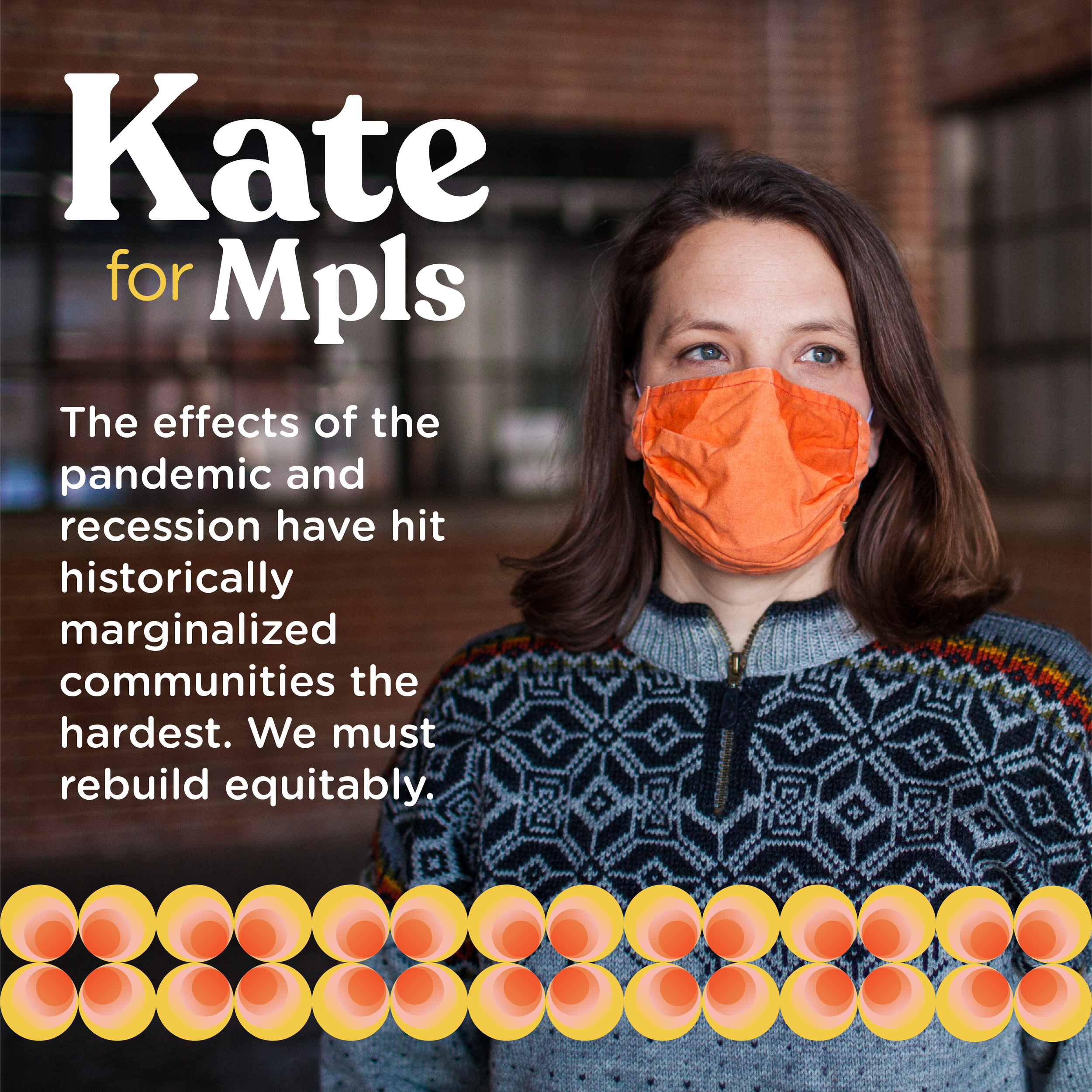
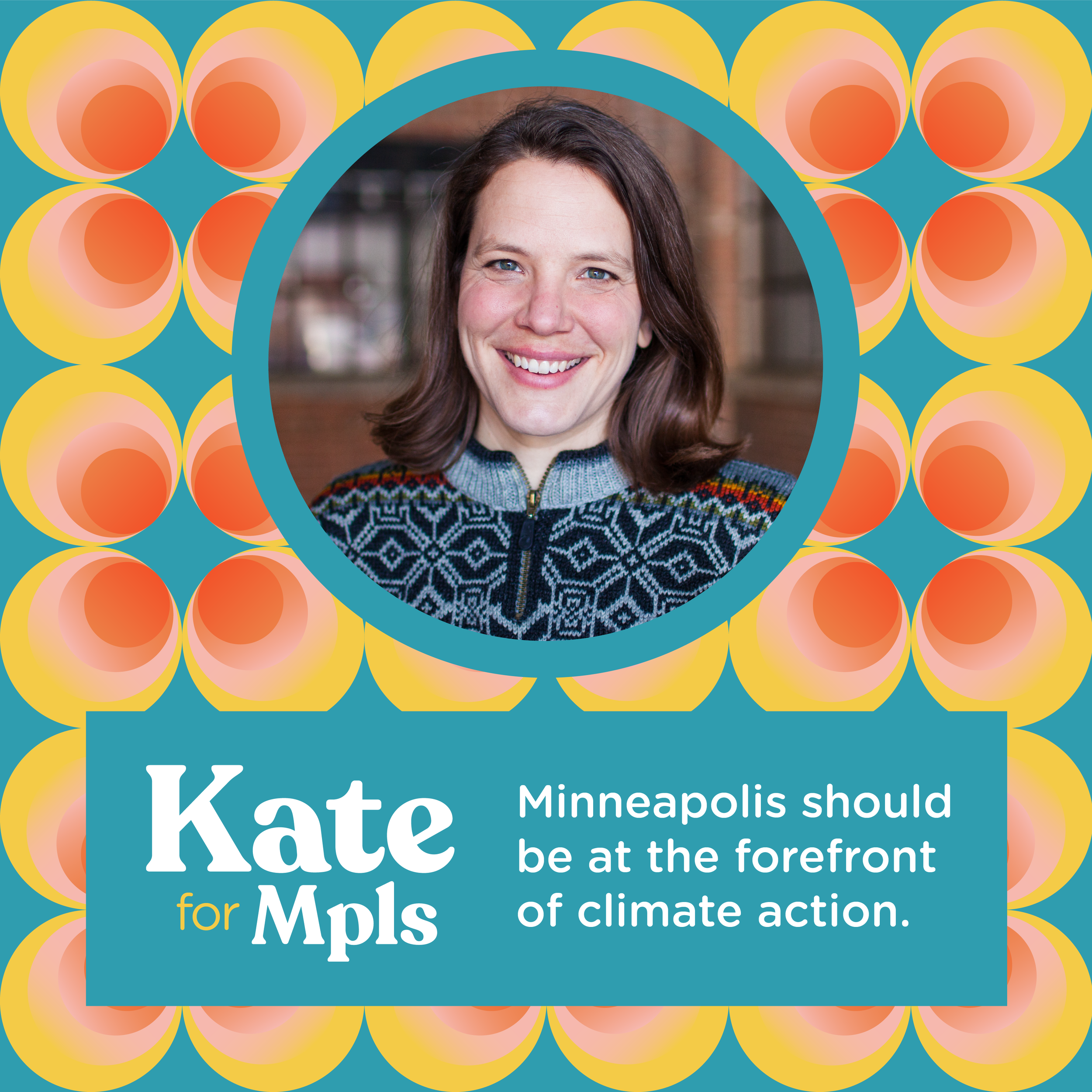
With that in mind, I designed a toolkit for Kate’s campaign that is bold and colorful, with a taste of 70s funk and feminine energy. Beyond a logo, I designed a library of patterns for use across Kate’s platforms, as well as a dozen social media templates for her team to use throughout the campaign.
Social Media Templates
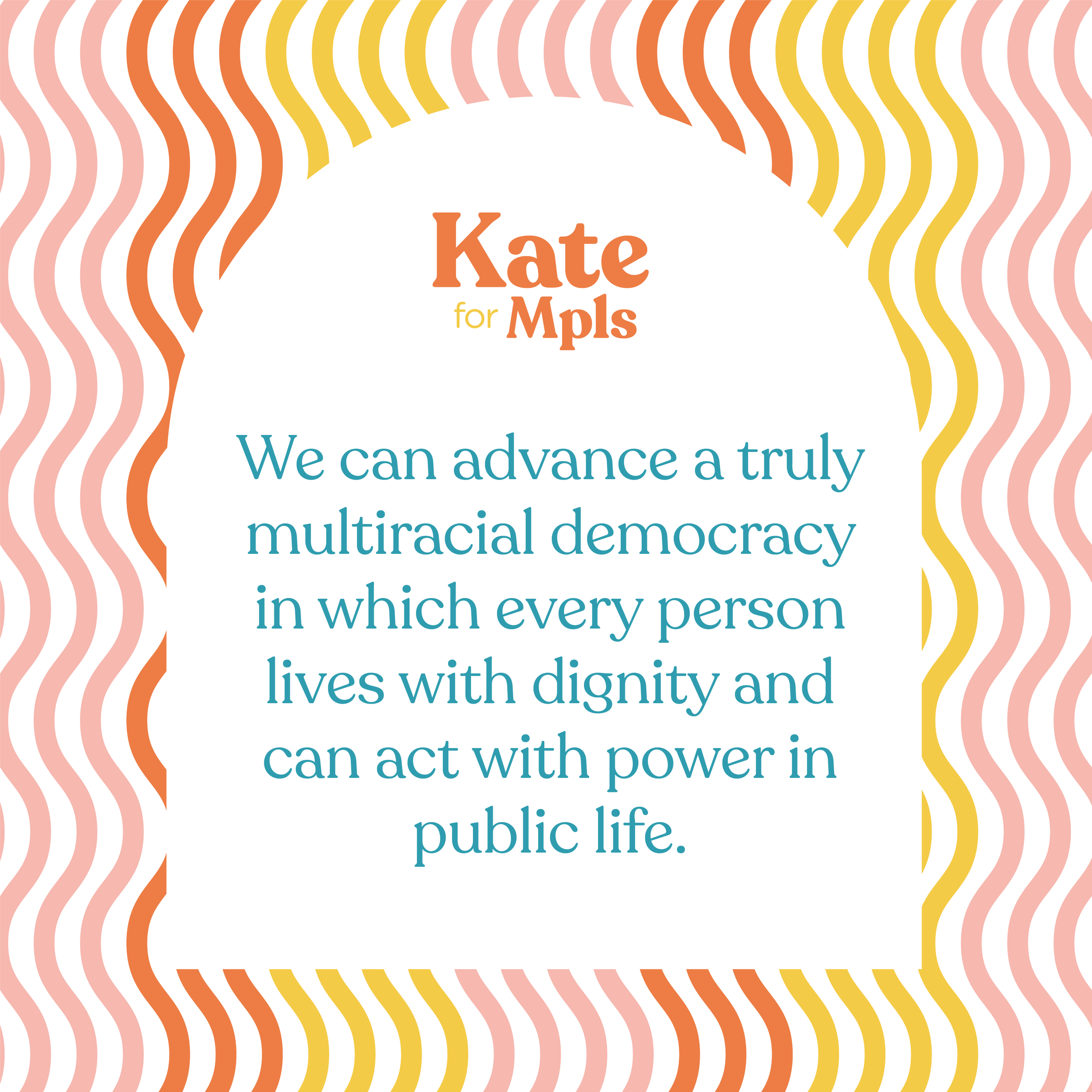
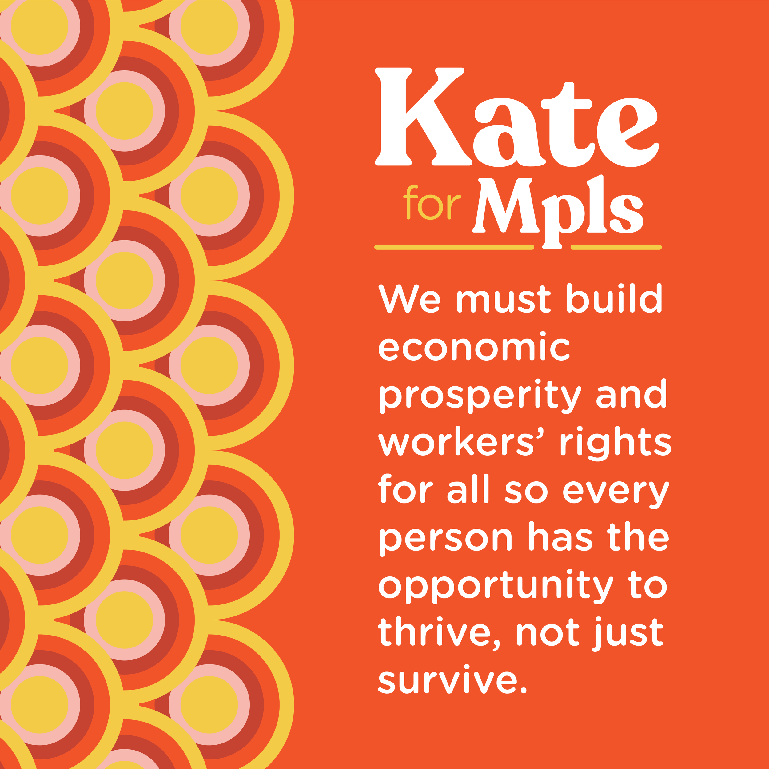
Pattern Library